Users interact with and experience products and services and a company must understand the interaction and influence that users lay over the success or failure of a product in the market. All too often, business owners and product developers ignore the importance of understanding UX psychology and customer’s “unpredictable” needs. In spite of everything, for products, services and the businesses to maintain, improve and survive, it is crucial for them to be able to understand people’s emotions, behaviors and motivations and use that to create a better UX. Using psychology helps developers create seamless end user experience and the rules mentioned below will get you to create some booming UX design. UX being a vast subject in itself, it will take more than just one article to cover everything, but for this article, let’s take a look at 7 psychology laws and principles and see how they are used and affect UX. Let’s begin:
Jakob’s Law
Jakob Nielsen of the Nielsen Norman Group came up with one of the many rules of UX design psychology that says that most users do not like changes and appreciate familiar experiences every time they visit a game, website or an application. Thus, it is important to create a balance between newness and creativity. Artistic designers look for reinvention and ways to make their user interface stand out from the rest but this zeal is not appreciated and accepted by many users. And, it is said most internet users like to read and absorb information in a similar fashion.
Hick-Hyman Law
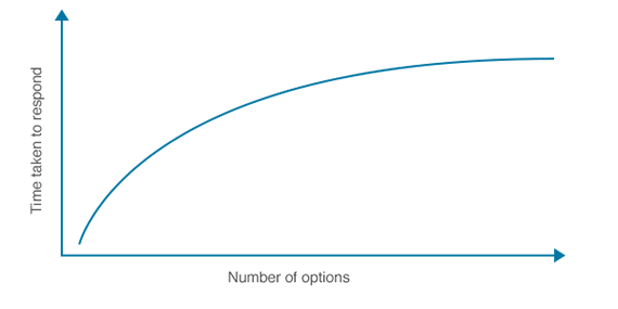
The Hick’s Law states that the time taken to decide increases logarithmically by increasing the number of choices. In other words, when the number of choices increases, the decision time taken also increases. For UX that means if you are giving a user too many choices or options that might not work well for your brand. Instead of bringing engagement, it might confuse them and annoy them as too many options makes it hard for a user to make a decision.

Image source: https://whatis.techtarget.com/definition/Hicks-law
The Gestalt Principle of visual perception
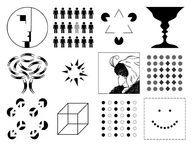
In German, Gestalt means to form or shape. The principle came into being based on the finding that the human brain has this great ability to fill spaces, find shapes & patterns, and simplify complex designs and structures. It subconsciously arranges parts into whole structures to better understand the surrounding. The principle is guided by laws of Proximity, Similarity, Continuation, Closure, and Figure/Ground that have individual uses in UX that improve functionality and bring clarity in the user interface.

Image source: https://www.interaction-design.org/literature/topics/gestalt-principles
Miller’s Law
Miller’s Law is all about keeping it simple. George A. Miller is a psychology professor at Princeton who wrote a popular paper “The magical number seven, plus or minus two: some limits on our capacity for processing information”. In his article, he proposed a law that stated “humans can effectively process no more than seven units, or chunks, of information, plus or minus two pieces of information, at any given time.” This law lays attention on the working memory rather than on the long-term memory which means the things that can be proactively nabbed by humans in a moment. When applied to UX design, the law says to keep it simple because more than seven elements on a single page might force the user to forget the rest which might not work in favour of the brand.

Image source: https://userinterfacedesign.ch/millers-law/
The Color Psychology
Colors play an influential role on a human mind and thus understanding colors and the psychology behind it is important to create a color palette that works well for the brand and their designs. Businesses nowadays have specific colors associated with their brand which they call brand colors. To choose the right colors for your brand, it is absolutely important to know their meaning and significance and how their shades affect them. Human’s emotions are connected with colors and they are not just a part of art but they also involve science. There are ways in which colors are perceived by the viewer. They are associated with a feeling or mood and that’s not it. These emotions and perception impact a design, gingerly. In a way, they are not just looked at but are thought about, understood, felt, and influences user experience.
The Von Restorff Effect or the isolation effect
They say our brains group similar objects and basis this prediction this rule states that one different element from the others stands out from the rest unlike in the case of similar objects that are paired together. Applying this effect into UX designing will get users to remember certain elements over the others. This can be done by highlighting most elements and leaving a few unhighlighted so that the unhighlighted elements grab maximum attention. For instance, when you are reading a paragraph you are more likely to remember the words that are in bold or italics rather than the ones in regular font.

Image source: https://blog.42courses.com/home/behavioural/the-von-restorff-effect
Mental Models
A human brain works in mysterious ways. This approach is based on how an individual’s thought process works in the real world. Well, there are expectations that every user has when they first land on a website, download an app, or play a game. Those expectations and basic knowledge in the head regarding the same are what you can call a mental model of how the user interfaces will work. The customers refer to these mental models in their head so that every time they undergo a new experience, it takes them less time to figure out everything from the scratch. When we relate this psychological trend to UX design, the mental models that a user creates in his brain lets them act in the most obvious manner. And, it is a UX designer's job to come up with a UX strategy to understand the user’s mental models and work around that making the user experience engaging and intuitive.
Brands and technologies perpetually update the mental models. To understand this better, a great example to go with this would be the right and left swipe on tinder that are associated with certain outcomes. Reversing the outcomes with the right and left swiping in any case would just confuse the users. To provide a lucid and smooth experience, the UX developers must comply with the commonly understood drill.
The above mentioned psychological trends are simple ways to provide a meaningful and relevant user’s experience but other than that, it is also crucial for a company to understand the user experience design psychology, in all. Social, behavioral, and cognitive psychology plays an important role in UX. One might have to put oneself in the user’s shoes to get a better understanding of the same. They say without psychology, a great design isn’t great. A design impacts the viewer’s mind in ways we are unaware of. Games, websites and applications have become complex as technologies have become more advanced. Thus, for a UX analyst it becomes absolutely essential to understand the user’s feelings, thoughts, and actions.
Having said that, Logic Simplified is a game design and development company that has user experience design professionals and game designers for hire who understand user psychology and implement solutions to create a win-win for both the client and the business. We start with the understanding that UX is one of the most important mobile game developer qualities and thereon, build and offer impeccable game design services at highly competitive costs. To know more, drop in your queries at enquiry@logicsimplified.com
 Get a Quote


